Set the word plainly.
A useful departure needs a clear starting point. Establish the text before questioning its scale, spacing or order.
A word is also an arrangement.
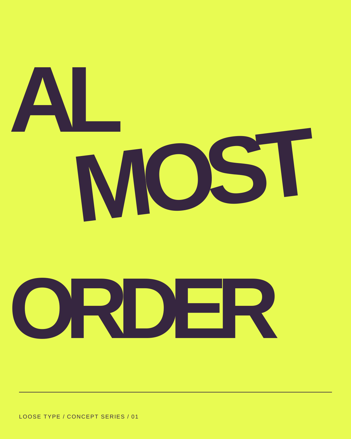
Poster 01 — Almost order.
Heavy sans-serif forms work against a thin editorial layer. Acid yellow gives the printed shapes a particular intensity; plum and lilac variants change the apparent pace without changing the basic typographic idea.
A useful departure needs a clear starting point. Establish the text before questioning its scale, spacing or order.
Displace a letter, enlarge a counter or interrupt a line. Let the disturbance do something specific rather than making every element compete.
Look for the moment where the composition becomes less immediate but more interesting. Keep a smaller caption as a steady route back to the language.